


Here at Eurofarma there is always a call to action, the courage to explore and seek a better place. The passion for discovery in taking the next step as if it were the first. For us, nothing is permanent except evolution. Together, we work in search of better results and we have the ability to see opportunities and transform focus and energy into development.
We walk with science and sustainability, transforming lives and relationships. We have an entrepreneurial and innovative spirit. We understand our expanded role in society. We exist to make health accessible so that everyone can live longer and better.
We are a brand that moves with the world. And that moves the world to take good care of our reason for being: you.
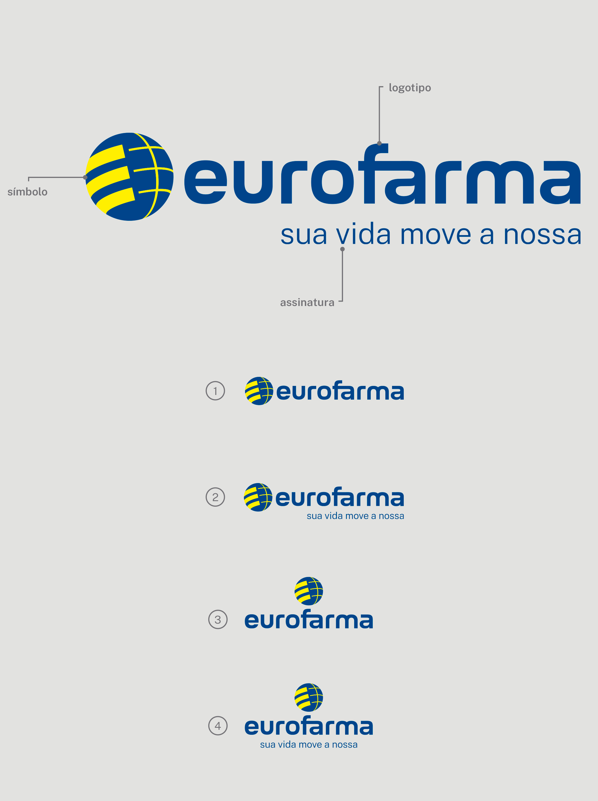
New logo
The proposal of the new logo is to bring simplicity and modernity, without losing our history. Now, we have a more rounded spelling with lowercase letters, making it easier to read. The globe became smaller and brings the premise of movement, expansion and time, with internal lines reduced and repositioned diagonally. This idea connects with one of our main values: nonconformism and the genuine desire that life is made of movement, and that we want to be along with everyone to support them on their journey.
New slogan
The change in the slogan is even more important for the company, as it is increasingly connected to Eurofarma's mission, vision, values and purpose, to make health accessible so that people can live longer and better. In a simple and direct way, the new text seeks to demonstrate that we do what we do for our patients, who are the ones who move us every day so that we can develop, create, invent and conceive products and services that truly transform their lives.
Evolution
In 2022 Eurofarma turns 50 years old and, over that time, we have updated our brand so that it is always connected with the evolution of our business. Check out the evolution.
Typography
The choice of typography was associated with the new concept of the logo, to bring a more pleasant reading and more rounded contours. So, in order to have this assimilation, we opted for Loos and Public Sans.